
Build a Reusable Searchable List in React with Typescript Generics


Site search is a common feature in web applications that allows people to find the information they need quickly and easily. Search implementation is particularly important in large, complex projects such as online stores and marketplaces.
Such applications are usually not limited to one main search on the site. They implement the searchable list in other parts of the application using the same structure and styles. The only difference is the display of search results and filters.
This article will show you how to implement generic search components in React and a reusable Searchable List with the Load More button and skeleton loading. We won`t touch the API logic implementation and will focus on creating the UI part of the search.
You may read this post to learn more about how to work with filters in NextJS.
Getting started
Let`s assume we have the following search layout structure that we want to use on two non-related pages: product search and user search.
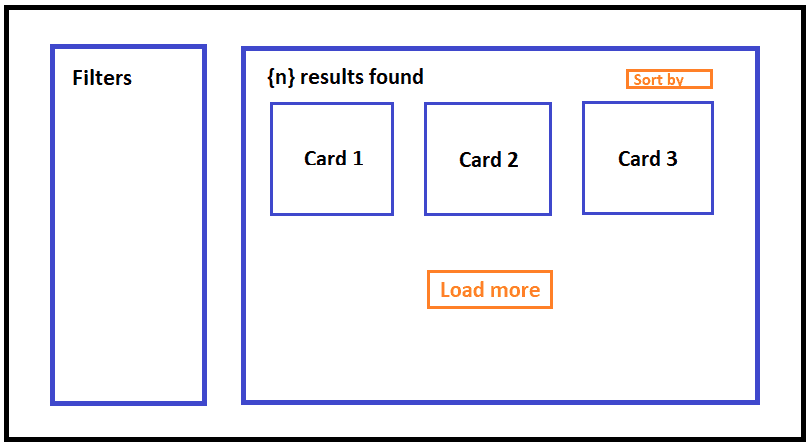
The left column is a filter panel that renders different sets of facets. The right column is a search results component that renders the total number of results, sorting, sets of cards, and the Load More button.
To make our lives easier, we will not implement each layout separately. Instead, we will divide the markup into several reusable components to have only one single source of truth for every repeated part of the search.
Let`s start the implementation.
Creating reusable search layout components
First, we need to break down our main search layout into several small independent components with their styles.
const SearchLayout: React.FC<IProps> = ({ children }) => ( <div className={styles.layout}>{children}</div>);
const SearchFilters: React.FC<IProps> = ({ children }) => ( <div className={styles.filters}>{children}</div>);
const SearchContent: React.FC<IProps> = ({ children }) => ( <div className={styles.results}>{children}</div>);- The
SearchLayoutis a flexbox container that comes with a few sub-components: SearchFilters and SearchContent; - The
SearchFiltersis responsible for displaying the filter panel; - The
SearchContentis responsible for displaying the search results container;
Now, add the following CSS code:
.layout { display: flex; gap: 2rem;
@media (max-width: 991px) { flex-direction: column; }}
.filters { flex: 1 0 auto;
@media (min-width: 992px) { max-width: 17rem; }}
.results { flex: 1 1 auto;}Consequently, we have created a straightforward, easily varied, and expanded structure. It also gives us a clear view of the React component tree on the page.
<SearchLayout> <SearchFilters>Search Filters</SearchFilters> <SearchContent>Search Results</SearchContent></SearchLayout>Creating reusable Searchable List with Typescript Generics
The next step is to build a generic SearchableList component that renders a set of cards, the Load More button, and the skeleton cards loading.
To implement that, we need to pass to the SearchableList component a set of properties and use TypeScript Generics to be able to specify the actual data type when executing the code. As a result, we get the following:
interface ICard<T> { isLoading?: boolean; card?: T;}
interface IProps<T> { data?: T[]; isLoading?: boolean; isInfinityLoading?: boolean; hasNext?: boolean; onLoadMore?: VoidFunction; skeletonCardsLength?: number; renderCard: ({ card, isLoading }: ICard<T>) => React.ReactElement;}
const SearchResults: <T extends unknown>(props: IProps<T>) => React.ReactElement<IProps<T>> = ({ data, isLoading, isInfinityLoading, hasNext, onLoadMore, skeletonCardsLength = 3, renderCard}) => { if (!isLoading && !data?.length) { return <p>No results found</p>; }
const skeletonCards = Array.from({ length: skeletonCardsLength }, (_) => renderCard({ isLoading: true })); const actualCards = data?.map((item) => renderCard({ card, isLoading }));
const cards = isInfinityLoading ? [...(actualCards || []), ...skeletonCards] : actualCards;
return ( <> <CardsLayout>{cards}</CardsLayout> {hasNext && ( <div className={styles.loadMore}> <button type="button" onClick={onLoadMore}>Load more</button> </div> )} </> );};The above code defines the SearchableList component with TypeScript generics and a variety of properties:
datais an array of cards shown as a result of our render. UsingT, we can pass the actual array type used when executing the code;isLoadingis the data loading state;isInfinityLoadingis a loading state that shows the cards loading by clicking the Show More button;hasNextis a state responsible for displaying the Load More button;onLoadMoreis a callback fired when the Load More button is clicked;skeletonCardsLengthis the number of skeleton cards that should be displayed at the bottom of the visible list after clicking the Show More button. It is three by default, which means three cards in a row. The value depends on the card layout;renderCardis a function that takes two parameters and returns the React element, the actual card component;
After clicking the Load More button, we create the skeletonCards array to show a skeleton loading. The array length depends on the skeletonCardsLength value.
If isInfinityLoading is true, we add the skeletonCards array to the end of the existing data array. If it is set to false, we render the actual result.
Creating SearchCounter and Card components.
Before showing how to use the SearchableList, let`s create a simple card and the search counter components.
interface IProps { card?: ICard; isLoading?: boolean;}
const Card: React.FC<IProps> = ({ isLoading, card }) => { if (isLoading) { return <Skeleton paragraph={{ rows: 3 }} />; }
return ( <div className={styles.card}> <h3>{card?.title}</h3> <div>Price: {card?.price}</div> </div> );};We specify the isLoading property to show the skeleton indicators while the data is loading (the Skeleton component is from the ant-design library).
The SearchCounter component renders the total number of cards and displays elements, such as sorting, passed through the children`s property.
interface IProps { count?: number; children?: React.ReactNode;}
const SearchCounter: React.FC<IProps> = ({ children, count }) => ( <div className={styles.resultCountRow}> <div className={styles.resultCount}>{count || 0} results found</div> {children} </div>);Using the SearchableList component on the page.
Let`s combine all the components and build the React tree for one of the search pages.
<SearchLayout> <SearchFilters>Filters</SearchFilters> <SearchContent> <SearchCounter count={data?.length} /> <SearchResults<IProduct> data={data} isLoading={isLoading} isInfinityLoading={isInfinityLoading} hasNext={hasNext} onLoadMore={loadMore} renderCard={({ card, isLoading }) => ( <Card isLoading={isLoading} card={card} key={card?.id} /> )} /> </SearchContent></SearchLayout>As a result, we got a clear structure of search components, which can be easily reused on different pages of the application.
A more detailed code example with the test API logic can be found here.
Conclusion
The article taught us how to divide the search markup into independent, reusable components and create a straightforward, easily varied, expanded structure. It also demonstrates how to build a generic React Searchable List that renders any set of items and contains the skeleton loading behavior.
Creating reusable search components can help you save development time if you need to implement the same search structure on different, non-related pages.
We hope this article was helpful to you! Thanks for reading!
