
Scalable CSS Layout: Everything You Need to Know


How to scale elements proportionally to screen size?
Recently, we were confronted with the task of creating a Scalable CSS Layout where all elements proportionally change at scale depending on screen size. Something similar to this.
In the example, site elements are automatically adjusted (increase or decrease) to the screen size and orientation without changing their original position. This approach allows displaying the site equally effectively on different devices, including retina displays.
Under standard approaches such as adaptive and responsive layouts, the behaviour of elements can vary depending on the screen resolution. For example, the columns' width is reduced by increasing the screen (50% on small screens and 33% on large), or component styles are changed on the page depending on screen resolution. With the scalable approach, all elements are always in their original position and only change in size, keeping proportion.
The article below will share our personal experience with creating Scalable CSS Layouts.
What are the starting points?
Our approach to Scalable CSS Layout is based on two starting points, usually provided by designers: desktop markup for the small screen and mobile markup. We create layouts only for those resolutions and make them identical to the design. For other screens, all elements are proportionally increased based on the starting point.
What CSS units to use?
We use a combination of CSS units, such as vw and em, to implement the Scalable CSS approach.
vm- relative to 1% of the viewport's width. 1vw corresponds to 1% of the display.em- relative to the font size of the parent element
To allow the dimensions of the page elements to change proportionally, we need to set the body font size in vm and use em as the basic unit of measure for all components on the page.
Elements in em depend on the body size. If we need to change the initial font size, we will update it through one body variable, and the dimensions of the elements will adjust automatically.
Convert vm into em based on the markup
Imagine we got from the designer two versions of the markups (desktop 1200px and mobile 320px), where the primary font size is 14px.
Using the formula below, we can convert the current font size to vm:
const vmFontSize = (100 * markupFontSize) / screenSize;markupFontSizeis the primary font size (14px)screenSizeis the screen size (1200px or 320px)
As a result, the body font size would be:
const vmDesktopFontSize = (100 * 14) / 1200 // 1.17vmconst vmMobileFontSize = (100 * 14) / 320 // 4.38vmbody { @media (min-width: 992px) { font-size: 1.17vm; } @media (max-width: 991px) { font-size: 4.38vm; }}You can also check the result in the online calculator.
Next, we need to calculate font sizes and element indents in em for all components on the page.
em is the CSS unit relative to the font size of the nearest parent. Since we have specified the font size only for the body element, we get 1em = 1.17vm (4.38vm for mobile) or 1em = 14px.
Thus, to calculate element font sizes and indents based on the values from the markups, we can use the following formula:
const elementSize = elementSizeInPx / bodySize;elementSizeInPxis an element font size in pxbodySizeis the primary font size in px (14px)
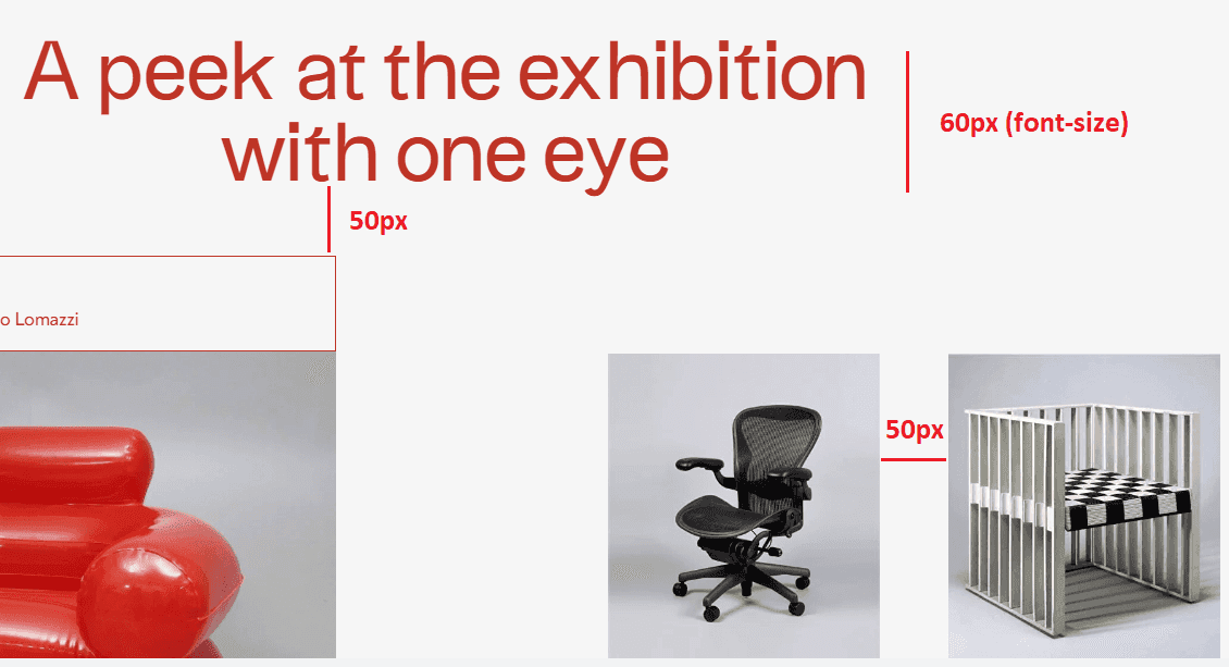
Let`s imagine we have the following markup (1200px): the title font size is 60px, the title bottom indent and grid gap are 50px, and the primary font size is 14px.
To convert these values from px to em using the formula above, we need to divide them by the body font size.
- The title font size: 60 / 14 = 4.28em
- The elements indent: 50 / 14 = 3.57em
However, it is important to understand that 3.57em (50px) between cards and 3.57em of the h tag differs because em` depends on the parent element font size.
- The grid gap is considered relative to the body font size, which is 14px, or 1em
- The
htag indent is considered relative to the title font size (60px, or 4.28em). So, to get the title indent inemwe need to divide this value by the title font size: 50 / 60 = 0.83em.
Now, we can extend our previous formula and divide the size of the current element by the parent font size or by the body size:
const elementSize = elementSizeInPx / (parentSize || bodySize);As a result, we get the following:
Markup (1200px):
body- 14pxh:- font-size: 60px
- margin-bottom: 50px
- grid gap - 50px
Values after our calculations:
body- 1.17vw (4.38vw for mobile)h:- font-size: 60 / 14 = 4.28em
- margin-bottom: 50 / 60 = 0.83em
- grid gap - 50 / 14 = 3.57em
Conclusion
With two "starting" points (1200px and 320px), a primary font size of 14px, and a combination of CSS units vm and em, we can make a Scalable CSS Layout with all elements on the page vary proportionally depending on screen size.
The life code example you can find here (please, click the "open in new window" tab to see the proper desktop version).
We hope this article was helpful to you! Thanks for reading!
