
How to Create a Collapsible Panel with Smooth Animation in React


The collapsible panel is one of the most fundamental components for building a UI on mobile devices. It helps us to save page space and hide content that is not immediately relevant. For example, the collapsible panel can show the menu by clicking the hamburger button or render sections information, editable forms, and other user action flows.
Many libraries, such as React Bootstrap, Material UI, or Ant Design, include collapsible panels with a smooth animation effect that can easily be used in your code. Also, you can install one of the npm packages, such as react-collapsed, which is very straightforward.
But in this article, we`ll show you how to build a collapsible panel with smooth animation in React from scratch without using any external libraries.
Creating a Collapsible Panel UI component.
The collapsible panel component you will create will look like this:
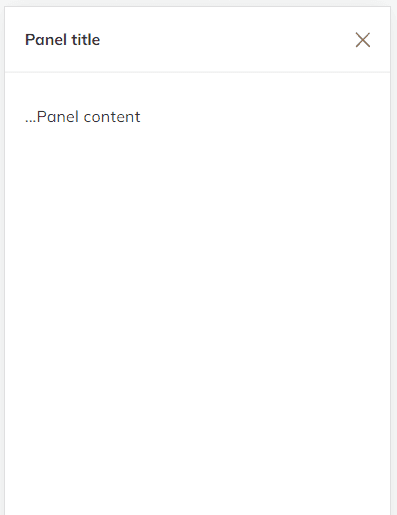
The component is a simple white panel that occupies all available screen space and has a smooth animation effect by clicking a button.
Create a new CollapsiblePanel.jsx file and add the following code to it:
import React from "react";import cn from "classnames";import { IconX } from "@tabler/icons-react";
const CollapsiblePanel: React.FC = ({ children, isAnimation, isOpen, onClose, title}) => { const classes = cn("panel", { "panel--open": isAnimation });
if (!isOpen) return null;
return ( <div className={classes}> {title && ( <div className="panel__header"> <h5>{title}</h5> <button className="panel__close" onClick={onClose} type="button"> <IconX /> </button> </div> )} <div className="panel__body">{children}</div> </div> );};The above code defines the CollapsiblePanel component that uses props to render the UI part of the component and the animation. Here, we use the isOpen property to display the component and the isAnimation property to render the panel smoothly. Also, we need to pass the onClose property to the button to have the possibility to close the component.
Now, add the following CSS code:
.panel { background-color: white; height: 100vh; left: 0; opacity: 0; position: fixed; top: 0; transform: translateY(4%); transition: transform 0.2s ease-in-out, opacity 0.2s ease-in-out; width: 100%;}
.panel--open { transform: translateY(0); opacity: 1; z-index: 3000;}
.panel__header { align-items: center; border-bottom: 1px solid #e3e3e3; display: flex; justify-content: space-between; padding: 0.25rem 1rem; position: sticky;}
.panel__body { height: calc(100% - 9rem); overflow-y: auto; padding: 2rem 1rem;}
.panel__close { background-color: transparent; border: 0 none; color: gray; cursor: pointer; height: 1.6rem; padding: 0;}We combine transition and opacity CSS properties to make a panel animation. Initially, we set the panel’s transition property to 4%; when it opens, we set it to 0. It allows us to create a slightly raised effect that makes the animation more attractive.
Creating a Collapsible Panel animation logic.
To create a panel with a smooth animation effect and be able to remove it from the DOM when it is not open, we need to define three React states:
const [isOpen, setIsOpen] = useState(false);const [animationOnStart, setAnimationOnStart] = useState(false);const [animationOnEnd, setAnimationOnEnd] = useState(false);- The
isOpenis responsible for opening/closing the panel. - The
animationOnStartis responsible for opening the panel smoothly. - The
animationOnEndis responsible for closing the panel smoothly.
To have a clear understanding of why we need three states, let’s take a look at the timeline picture:
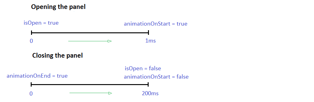
If the value of isOpen is true, we set the animationOnStart to true within 1 ms. The slight delay gives us time to apply transition CSS properties to the panel. We must wait for the collapsible panel to be rendered in the DOM to run the animation.
To close the panel smoothly, we set the animationOnEnd to true. Then we set the animationOnStart and isOpen to false within 200 ms. We delay the panel rendering completion and removing it from the DOM until the animation is complete. In this case, the delay value should be the same as the CSS transition duration value.
Based on the steps described above, let’s create a useCollapsiblePanel hook with the following logic:
import { useEffect, useState } from "react";
const durationStart = 1;const durationEnd = 200; // Equals to the CSS transition duration
const useCollapsiblePanel = () => { const [isOpen, setIsOpen] = useState(false); const [animationOnStart, setAnimationOnStart] = useState(false); const [animationOnEnd, setAnimationOnEnd] = useState(false);
const handleOpen = () => { setIsOpen(true); };
const handleClose = () => { setAnimationOnEnd(true); setTimeout(() => { setIsOpen(false); setAnimationOnStart(false); }, durationEnd); };
useEffect(() => { if (isOpen) { setAnimationOnEnd(false); setTimeout(() => setAnimationOnStart(true), durationStart); } }, [isOpen]);
const isAnimation = animationOnStart && !animationOnEnd;
return { handleClose, handleOpen, isAnimation, isOpen };};The handleOpen method sets the isOpen to true. To ensure that the isOpen value is true and to make our operations more synchronous, we call the useEffect hook in which we set the animationOnStart to true using setTimeout. Also, we reset the animationOnEnd to the initial value.
The handleClose method sets the animationOnEnd to true. Then, to close the panel, it sets the isOpen to false within 200 ms and resets the animationOnStart to the initial value.
Based on these three states, we can define the isAnimation const responsible for the CSS transition styles:
const isAnimation = animationOnStart && !animationOnEnd;Applying the animation logic to the Collapsible Panel UI component.
Let`s combine all we described above and apply the panel to the hamburger menu button.
import React from "react";import { IconMenu2 } from "@tabler/icons-react";import CollapsiblePanel from "./CollapsiblePanel";import useCollapsiblePanel from "./useCollapsiblePanel";
const HamburgerMenu: React.FC = () => { const { isOpen, isAnimation, handleClose, handleOpen } = useCollapsiblePanel();
return ( <> <button type="button" onClick={handleOpen}> <IconMenu2 /> </button> <CollapsiblePanel isOpen={isOpen} isAnimation={isAnimation} onClose={handleClose} title="Menu title" > ...Panel Content </CollapsiblePanel> </> );};As you can see, we can use any button to show the panel and pass any panel content. We must invoke the useCollapsiblePanel hook with the required props and pass them to our components.
The life code example you can find here.
Conclusion
The article taught us how to create a generic collapsible panel with a smooth animation effect without using external libraries. The trick is in combining several React states and transition CSS properties. Each state is responsible for a particular component behavior.
If you need to build a collapsible panel with a specific UI and don`t want to customize the ready-to-use library, this solution can help you save development time.
We hope this article was helpful to you! Thanks for reading!
