
6 Useful Tips on How to write clean HTML and CSS Code


When working on projects, especially large ones, you often notice that developers are more focused on writing the correct JS code and do not pay due attention to the HTML/CSS. And this sometimes makes layouts and styles turn to mush, which is hard to maintain. Therefore, we will highlight a few points that will help make your HTML and CSS code cleaner.
6 Best Practices to keep your HTML and CSS code clean
1. Do not use Flex properties with no needs
Flex is a useful tool that makes writing styles much more straightforward. But sometimes, you have to deal with the fact that it's used wherever it's necessary and not. It is especially noticeable when using the Atomic CSS technique, such as Tailwind CSS.
Let`s examine the code example from one of the actual projects.
<div class="flex flex-col justify-center"> <div class=”flex”> <div class=”flex flex-col”> <div class=”flex items-center”> <h4 class="mb-md">heading</h4> </div> <p class="text-black">text</p> </div> </div></div>- The flex properties of the first
divare correct because they center the child component vertically. - The following
divis an unnecessary wrapper and can be removed. - The flex properties of the third
divare redundant because its children have the column direction by default and do not need to specify the flex here. It may make sense only:- If you need to change the order of elements.
- If children need to be placed in one line. In this case, the
flex-colneeds to be removed.
- The last
divthat wraps theh4element is redundant because it contains only one block element.
So, based on what we discussed above, we can rewrite the code this way:
<div class="flex flex-col justify-center"> <div> <h4 class="mb-md">heading</h4> <p class="text-black">text</p> </div></div>Much better, don’t you think?
2. Keep the media queries in order
Avoid frequent styles override based on the screen resolution when using media queries.
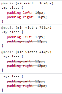
The above example demonstrates incorrect usage of media queries: two different resolutions contain similar padding values that override each other. To make it more readable, we can use two options:
- The
max-widthwith the combination ofmin-width. - Keep only the
min-width: 1024pxand remove others.
@media (min-width: 1024px) { .my-class { padding-left: 16px; padding-right: 16px; }}
@media (max-width: 1023px) { .my-class { padding-left: 12px; padding-right: 12px; }}
// or
.my-class { padding-left: 12px; padding-right: 12px;}
@media (min-width: 1024px) { .my-class { padding-left: 16px; padding-right: 16px; }}In both cases, the console will be much cleaner and the code more readable.
3. Use variables for repeated values
Each application contains its own set of styles:
- colors
- font sizes
- indents
- others
These values are better stored in the variable file, so you can easily reuse them. Additionally, most CSS techniques and methodologies have the ability to create CSS themes whose values can be used across the web application.
4. Pay attention to the use of some CSS properties
Do not specify 100% width to block elements
All block elements, such as div, p, h, etc., have 100% width by default, and there is no need to specify it for no reason. Depending on the parent container's width, these elements will occupy all available space. If there is no width for the parent container or the block element is located after the body, its width will equal the screen width.
<div class="element">content</div>
.element { …properties width: 100%; // This property needs to be removed}Try to avoid using the height property for modules
In most cases, modules on the page have a dynamic height depending on the content, and explicit height indication can cause bugs. This is especially true for small modules such as info blocks, banners, etc. Use the padding property instead of the height.
.element { border: 1px solid #d8d8d8; height: 200px; // Bad case}
.element { border: 1px solid #d8d8d8; padding: 20px; // Better to use padding to make it dynamic}Do not use "text-align: left" with no reason
All elements have left alignment by default, so we can usually skip specifying this property.
Conclusion
Following these points can significantly improve your HTML and CSS code and make it clean and more readable. Writing clean and readable code not only makes it easier to maintain and update your projects, but it also helps ensure that your website or application is accessible to everyone. You should also learn about Maintainable CSS.
We hope this article was helpful to you! Thanks for reading!
